Marketing Materials Refresh for Healthcare Provider
Updated: Feb 22
Let’s Work was approached by a marketing agency to refresh the branding materials for Aaron Women's Center, a reproductive health clinic in Houston, Texas affiliated with Texas Ambulatory Surgery Center. The goal was to modernize key printed materials to better reflect the professionalism, compassion, and credibility of the clinic while maintaining alignment with its existing logo and brand aesthetic.
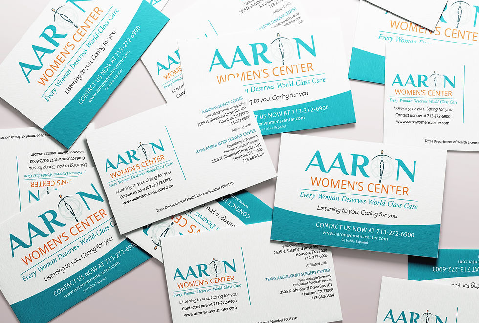
We were brought in to redesign three core collateral pieces: business cards, brochures, and cost sheet flyers. Each asset needed to feel cohesive, elevated, and easy to navigate for patients.
The Challenge
Healthcare branding requires a delicate balance.
For Aaron Women’s Center, the materials had to:
Communicate trust and medical credibility
Feel approachable and compassionate
Clearly present sensitive information
Improve readability and organization
The existing materials lacked visual consistency and modern structure. Information felt dense, and the design did not fully reflect the level of care the clinic provides.
The Strategy
Our approach focused on three pillars: clarity, cohesion, and confidence.
Clarity
Clarity meant simplifying layouts, improving typographic hierarchy, and ensuring that key information could be scanned quickly.
Cohesion
Cohesion meant developing a refreshed visual direction across all materials, consistent color usage, updated typography, and structured layouts that aligned across every touchpoint.
Confidence
Confidence meant elevating the overall aesthetic so the materials felt established, professional, and trustworthy. Every design decision reinforced credibility while maintaining warmth.
The Work
Business Cards
A clean, modern layout with strong visual hierarchy. Contact information was organized for quick access, while maintaining a polished, medical grade aesthetic.
Brochures
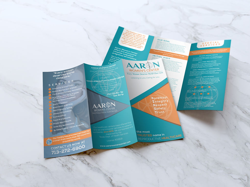
We restructured the content to improve flow and readability. Sections were clearly defined, whitespace was used intentionally, and the visual design supported the clinic’s messaging without overpowering it.
Cost Sheet Flyers
These required particular attention to clarity. We redesigned the layout to make pricing and service information easy to digest, reducing visual clutter and guiding the eye naturally through the document.
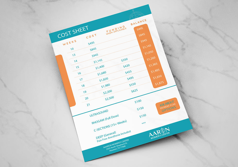
Across all pieces, we introduced consistent typography, refined color usage, and balanced spacing to ensure a cohesive brand presence.
The Result
The refreshed materials now reflect the professionalism and care that Aaron Women’s Center provides every day.
The new business cards, brochures, and cost sheet flyers feel modern, organized, and aligned with their affiliation to Texas Ambulatory Surgery Center. Most importantly, they support patients with clear, approachable communication. This project is a reminder that even foundational print materials carry brand weight. When done well, they build trust before a single conversation begins.
